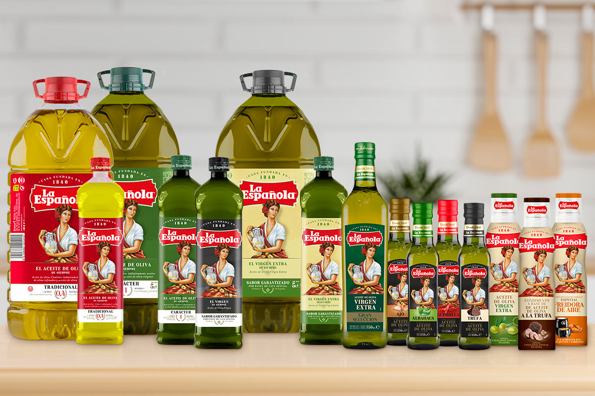
Aceites La Española has carried out a restyling of its image in order to stand out on the shelves. La Española has carried out a restyling of its image in order to stand out on the shelves. Its new logo, more visual and with a more modern touch, preserves the iconic lady with the pitcher, in addition to the characteristic red color for the traditional 0.4 olive oil. The brand has also renewed both the design of its packaging and its labels, with the aim of communicating its messages more clearly to the consumer.
With this update, La Española enters more current territories that connect with new consumers, highlighting innovation as a key attribute that allows the brand to adapt to new trends. All this, maintaining the traditional values of the company, founded in 1840, being the oldest olive oil marketer in Spain, a pioneering, historical, local brand with business values and culture: family, authenticity, closeness, effort and humility.

After this image redesign, an evolution will be carried out in the brand’s communicative tone, as well as the introduction of novelties in the form of new product designs or new communication channels. An example of them is the launch of a perfil en Tik Tok, with specific content adapted to the platform.
To carry out this evolution, both aesthetically and conceptually, in La Española, we have had the collaboration of marketing and business strategy professionals, both internal and external. Likewise, the participation of consumer working groups has been crucial, who have contributed their vision of the brand.
La Española is the classic olive oil, with a presence in more than 120 countries and having established itself as the best-selling Spanish olive oil brand in the world, being also an icon of Spanish culture. It is a renowned brand and stands out as a member of the Forum of Renowned Spanish Brands since 2002.

